March 2026
M T W T F S S
 1
2345678
9101112131415
16171819202122
23242526272829
3031  

Archives

Categories

Creating a graphic novel but stopping along the way to take some photos, eat some food and admire great art!

Recent Comments

Step by step Hulk by Lee Sargent

From yesterday’s post, Lee Sargent is providing a step by step breakdown of his work. From Brisbane Australia he’s an an absolute gun Asteroids player on the Atari 2600.

Preliminary Work :
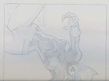
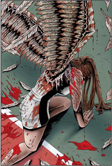
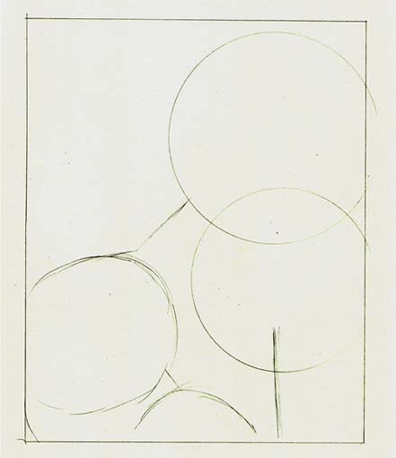
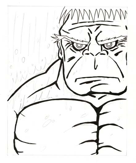
I found a shot taken from the front, in the rain, focusing directly on the hand and face that I thought might be interesting enough. My first job was to sketch out where everything was going to be on the page. I like to work within panels when I’m illustrating, especially when doing a comic book character because it is a classic convention of framing in comic books.

Within the frame I used a compass to put the locations where the different parts of Hulk were going to be and to give some small amount of relation. I like to work pretty loosely and freehand but find it handy to grid stuff out on a page.

Hulk

Once the pencils are done I like to grab a 0.5 pen and put all of the basic lines in, at this stage I generally avoid thickening any of the lines even if I have already with the pencils. I want a bare line frame to build up and often I’ll erase some of the more over worked pencil lines out to give me a little more freedom to build those lines ups.

Hulk

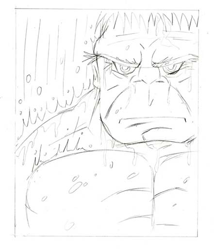
I’m a huge fan of bold strong lines and will more often than not go a little overboard with them. I use a small or medium copic multiliner brush pen at this stage because whilst giving up a little of the control it does give me some broad spontaneous lines which I love anyway. There are sections here that will be filled in with black so I leave the line work alone, specifically in this example the hair and eyebrows.

Hulk

I hate using markers to colour large areas but of course there is no choice since this is my chosen media, I sometimes envy the digital artists in these cases. The trick is to minimise the amount of lines that will appear as you colour the large areas. I don’t have too much trouble with this as I keep fairly short strokes and a little consistency in the application. The trouble begins when you are going around things like the water drops etc. Often they’ll come up quite a bit darker because you took your time getting those bits right. It’s all a matter of blending at that stage, and patience.

I then use a darker marker to highlight shadows and folds. Sometimes I’ll use various shades of gray, in this case I had three darker shades of green above ‘grass green’.

Hulk

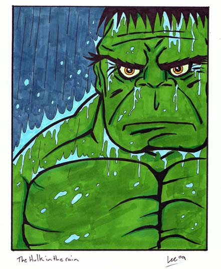
I also leave the water and the rain alone as I’ll use different pens for this. By now I’ve got a pretty good idea if this illustration is going to work or not and using the bigger brush strokes gives me the opportunity to correct some mistakes, the eyes in this case were fixed by ignoring the underlying inked lines.

Thanks for the fantastic walk through. It’s always great to see step by step the thought process of an artist. Anyway tell me a bit about yourself.

I’m married with a one dog, one parrot and some fish. I am a student of popular culture, specifically the comic book medium and its spin offs into other media, giant Star Trek geek as well as most other forms of science fiction, I enjoy also reading mythology which again ties in with my focus on pop culture. Obviously comic books are going to be a big part of my life, drawing/illustration is another thing that I love and do to unwind.

I really hate literary snobs, people who dismiss popular culture as fluff or not as important as the current darling of the literary world. There is a pretentiousness there that something is only important if the elite endorse it and something is without value if the general population enjoy it. I just dislike that way of thinking and I think that popular culture icons are beginning to smash through the barrier, I saw on the platform at the train station a woman dressed in business attire reading Philosophy and Metallica which I think is fantastic.

That would be a very interesting mix of heavy metal and philosophy! How would you describe your artwork?

LOL, I wouldn’t. Comic book style of course, I don’t sketch traditionally, I prefer the comic book look and feel. During high school I ran into trouble in art class for not deviating my style. I never really understood why I couldn’t just draw in that style but I get it now and wish I was a little more receptive to exploring other styles and media.

I like drawing unaided, so without rulers and guides so it is rare that you’ll see a very straight line in one of my illustrations, I like the shakiness that freehand creates although I admire the artists who do have those perfect circles and straight lines, it just isn’t me though.

So who would rate as your artistic influences?

Edvard Munch and not just for his ‘The Scream’ although that is a brilliant piece but the despair found in his other work has always influenced my thoughts when portraying superheroes who are usually seen as victorious or happy in dark places. Lichtenstein is another influence in that he brought comic book art into the mainstream, I really like when doing an illustration is to create a piece that could be part of a greater page or frame, of course his blatant use of others work without credit is a grey area in ethics for me.

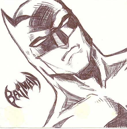
As far as comic book artists I have to say that Norm Breyfogle was a very early influence on me, I still am yet to encounter an artist with the same kinetic feel to their character, his run on Batman was very mind shaping for me. More recently I’ve been going old school with the artists that I absorb the most from, Kirby (the king) is just a revelation, I love Darwyn Cooke’s work and Bruce Timm. My favourite artist and the one artist that I am most jealous of has to be Tim Sale and you can see the influence of his amazing work in the Hulk illustration that I did for this site, specifically the eyes and brow. I’m completely convinced that this is the way the Hulk looks!

Norm’s work on Batman is still the definitive Batman in my opinion. I got to meet Tim Sale when he was down, even getting a personal sketch! Thanks again for your time and a wonderful showcase piece!

Be sure to check out more of Lee Sargent at his blog :
http://quityourdayjob.com.au

Hulk by Lee Sargent

Lee Sargent from http://www.quityourdayjob.com.au is showcasing an amazing Hulk piece in the rain. Check back tomorrow where Lee will detail the entire process from beginning to end. If interested in his other works, he’s got an X-Men card set on sale.

Hulk in the rain :

Tea and Scones

Tea and scones are the perfect afternoon snack (or if you are Malaysia curry puffs are the go!) From a tea shop in Sydney CBD, this one’s a favourite secret spot of mine.

Fresh scones with cream and strawberry jam :

A good scone can’t be too dry and maintain a texture in between a cake and a bun. These ones are very “melt in your mouth” and a perfect complement to the tea. I love a splash of cream and jam for the experience.

Pouring milk into black tea :

Puny Parker – Vitor Cafaggi – 21

I like this one. Something about the snow always reminds me of Calvin and Hobbes. Hehe . . the final spider image is cute!

Batman by Franc Czuba

It doesn’t seem fair but this is one of Franc’s doodles on a napkin. I wish I could create art on the spur of the moment!

Catwoman by Franc Czuba

Franc Czuba is one of illustrators on Dusk (written by David Doub). He has a very fusion based style mixing Japanese manga with exaggerated anatomy and perspective with a cleaner American style rendering. Franc was kind of enough to create a Catwoman showcase including his sketches to demonstrate his work.

Final :

Preliminary sketch 01 :

Preliminary sketch 02 :


Before we launch into your artwork, what do you do in your spare time?

I like taking my son to the park, reading to him, helping him with math and spelling. Karaoke. Sentence fragments. Big fan of comedians, especially Bill Hicks, Frank Caliendo, Lewis Black, among
others. I’m a very boring guy.

Haha . . I don’t think you’re boring at all.
Anyway onto your work. Did you train formally?

Self-taught. And self-training, I guess. I had training at ; an acting school in New York. I still apply what I’ve learned there for storytelling, facial expressions. Posture. Body language. I have also read a lot of books on anatomy and perspective, and I still use comic books as reference.

And, of course, all the notes I received at conventions over the years. None of the notes were really too consistent, though. So it’s been a challenge. But well worth it. Took a lot of notes. It’s been a great learning experience and I’m still learning.

Who would you consider your artistic influences?

Good question. But there are way too many great artists for me to list. I also take my inspiration from very good writing as well. And music. Also way too many to list.

Thanks for your time!
Good luck with Dusk and your future endeavours. I’m sure we’ll see your name pop up on some new and exciting project.

Ramen with pork spare rib

A very traditional ramen with thick broth served by an eatery in one of the food courts in Sydney CBD. The pork spare rib ramen is limited to 10 bowls a day so it’s something I had to try.

Ramen with pork spare ribs :

The broth was made using over 120kg of pork bones and was a little too thick for me but I was told this was how this dish is originally made. The pork spare rib was especially tasty although a little difficult to eat with chopsticks.

Exterior of the shop :

Worth trying although next time I’ll be taking the option for the less thick version of the soup!

Puny Parker – Vitor Cafaggi – 20

You have to read last week’s strip to understand where Peter got his photos from. On a Spider-man related note, Betty Brant was one of Peter’s love interest appearing in the comic way before Mary Jane made her appearance.

PLB Comics Presents 02

Yesterday’s post was a showcase of Issue 01. It’ll be worth checking out some of the great artwork that has carried forth into Issue 02.

Copies are available from http://www.plbcomics.com/

Cover of Issue 02 : (Variant)

2 Page Spread – Click to see full size :

PLB Comics Presents 01

PLB Comics Presents is anthology of various works from different comic artists showcasing their works. I had the opportunity to talk to one of the creators behind the series Josh Shockley to ask him how it all started.

Cover for Issue 01 :

Page 8 (Black and White) :


Page 8 (Colour) :

So how did it all start?

PLB Comics “started” I guess when I was about 7, I was a little kid and I started drawing my own little comics. When my younger brother turned about 5 years old he got into it to. We spent the majority of our youth drawing comics on mom’s kitchen table.

But when we really got serious was about 3 ½ years ago. I’d graduated from college and had turned 25 and was about to get married, y’know the whole grownup thing. Then it occurred to me that If we were gonna try and make a run of it with the comic book thing that now was the time. Me and my brother Mat Shockley had a 8 page story that we’d previously submitted to a contest that we’d decided that we wanted to print, as well as some other ideas. Our buddy Mike Carmean that we went to high school with had a story he wanted to do, so we figured the best thing to do was to put together a “Marvel Comics Presents” type book, with different ongoing stories.

It’s an interesting format with some great stories! So what happened when the first issue was released?

After the first issue was printed we started hitting up the cons, we appeared in a few local art shows and started getting some feedback. We’ve been pretty fortunate in the local support that people have given us. Since then, we’ve just been keeping busy, trying to keep the pace going, the second issue came out last fall and the third issue will come out this fall.

How was the process of getting everyone together onboard for the project?

Organizing the people involved wasn’t difficult, Me and Mat go way back with Mike, and Karlton (one of the writers of Gideon and Sebastion) we went to college with. We recently welcomed another college buddy Jason Shipp into the PLB Family. Jason is writing and drawing his own Magna epic creation entitled “OCEANTO”. It’s fantasy/pirates/ninja/sweeping adventure type of book, and it’s set to debut this Fall, same time as PLB COMICS PRESENTS # 3. We’ll have em both for the Baltimore Comic Con this year.

Awesome! It looks like PLB is slowly branching out. With different people, was it hard organising the roles each of you had to play?

All the heavy decisions are made by Me, Mat and Mike, we like to keep things as informal and laid back as possible. They both say I’m the president or whatever of the group, but it’s really not that official. Mike handles the money/business side of things. Mat keeps his nose to the grindstone drawing, pretty much all the time. I ‘m just happy in general to work with such talented people. The guys really are some of the best talent out there in indie books today, I want our company to take off because they really deserve it to work, and if it does I know there gonna bust their asses to put out the best damn books possible.

I’m also interesting in the more technical aspects. Was it difficult to get your head around the printing process?

Printing is tricky, used a different printing company for the first two issues, and I think were going to use another different one for issue 3 and Oceanto. Printing is so tricky, it’s definitely a learning process, our first print run of issue 1 was thru a company in texas and they did a good job, but it was a minum order of 1,000 copies, which has left us with a ton of books still. We got issue 2 printed in Canada because it was so incredibly cheap, that is until they tacked on the “through the roof” shipping costs, plus they were 2 weeks late shipping them to us, apparently the original shipment got lost and they had to do another print run. But anyway we’ve found a pretty decent company out of Jersey that were gonna do issue 3 with.

So what’s the plan for PLB in the future?

In October were going to be going back to our favorite con- the Baltimore Comic Con http://www.comicon.com/baltimore/ on Oct. 10th and 11th where we will be debuting PLB COMICS Presents # 3, and Oceanto # 1. Both books will have varients covers- one of the variant covers for PLB #3 is an “Illusions” exclusive, and we be available ONLY at Illusions Games and Comics in Sailsbury.

Then in late November/ Early December were realeasing Seraphic # Zero. Seraphic zero will contain the first 3 parts of the Seraphic storyline that are featured in PLB COMICS PRESENTS as well as the additional 4th part of the chapter, and it will be in full color. Mike is very excited about putting out this book, as it was originally intended to be seen, in full blazing color. After issue zero, Seraphic will continue in it’s own title with the first issue coming out sometime the following year. Were all very excited, hopefully at some point in time we’ll be able to make some real money off these books, but for right now were just plugging away. There are so many talented indie guys and gals out there in the same boat as us, there’s a real sense of comradey amongst the independent comic book scene, these are the guys that truly love what t hey do, even if it means they go broke over it. I’d strongly suggest anyone interested in good reads, check out our friends on our myspace account and the adds in our books, there are so many alternative’s out there for those who don’t want to read Marvel or DC. It’s important to me and the rest of the PLB boys, to get the story out there, that’s the most important thing.

Thank you so much for your all time and your words. I wish you all the best in your endeavours and stealing a line from one of the Big 2, “Make mine PLB!”.

For copies of PLB Comics Presents check out :
http://www.plbcomics.com/store

It can also be purchased locally thru :
Illusions Games and Comics
726 S. Salisbury, Blvd. Salisbury,
MD 21801
Phone: 410-742-0172

Other links :