Star Wars – To Catch a Princess by Dion Hamill
Featured artist Dion Hamill is today’s guest author as he describes in detail the step by step process involved in creating this particular showcase piece. The final result is absolutely amazing!
Dion Hamill – Guest Post :
I thought I would create a short step by step for my latest artwork featuring some Star Wars characters.
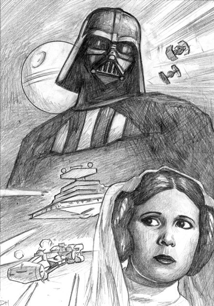
After I’ve found good references for my characters and the spaceships I start to do small thumbnail sketches. Once I’ve worked out a composition I’m happy with I create a larger detailed pencil sketch on paper with an HB pencil.
Usually I create my artwork at double the size of my preliminary sketch but I reverse the process for sketch cards, which are only 2.5 x 3.5 inches. Doubling the size of my pencil sketch allows me to work out finer details and refine lines and composition.
Once I’m happy with the pencil sketch I scan it into the computer and reduce it down to the size of the final artwork, which will be 5 inches high by 3.5 inches wide because it is 2 sketch cards in one.
I create a printout and then using carbon paper I trace that image onto illustration board. It seems like a long process but I do it this way so I do not damage the pencil sketch, which I can use later for a larger image or sell on its own.
Once I’ve got my line work ready on my illustration board I’ll add in a few shadows with pencil but nothing too detailed. The most important part is to keep the line work as close to my original as possible.
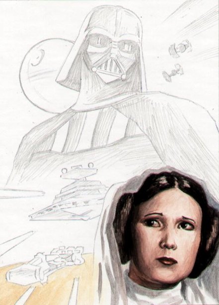
Using very diluted gouache I start by adding my flesh tones to Leia’s face. I’m not getting too detailed at the moment because the flesh tone will change as I add background colours. I start with Leia because she will be the most detailed feature on the page and stand out the most, so I want to make sure I capture her likeness as close as I can.
I like using gouache because I can work back into the paint at later stages by wetting the surface and reactivating the paint. I’m also able to mix a lot of my colours on the illustration board, which I find is a great way to blend tones and grade shadows.
Now I begin adding some surrounding colours. I block in large areas of black but I don’t want the background to be completely black so that Darth’s shape is defined against the space background.
For the space ships I use 2-3 shades of chromatic greys. Because they are so small there is no need to make them too detailed. Just by creating the basic shape and making them as recognisable as possible the viewer’s brain will add in the missing details making it seem like a far more detailed image.
For the lighter details like high lights, the laser beams, and explosions I leave them completely white and add colour to the outer edges giving them a glowing appearance.
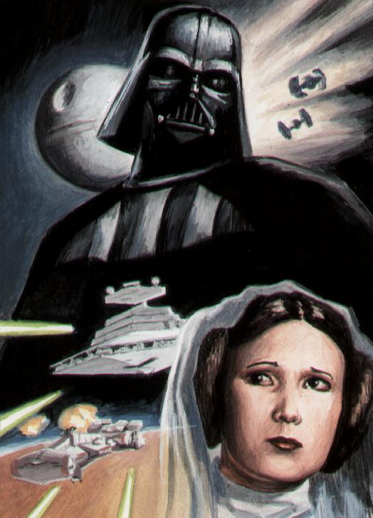
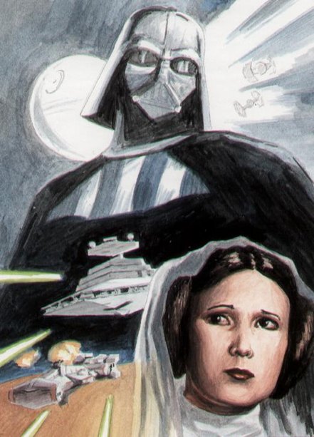
Now I start to darken the background, all the while I’m refining Leia’s face the spaceships and defining the harder edged lines. Using the same colours from the backgrounds I add these into my shadows. By doing this it merges my montage of images and nothing stands out looking as though it doesn’t belong there and detracts from the composition.
To finish off I darken any shadows that need darkening so as to push the viewers eye to areas of interest as well as increase highlights to do a similar job.
Then I add a few speckles in the background for stars to increase the feel of space.
Not quite content with the planets horizon line behind the blockade-runner I darken it so that it’s not fighting for attention against the spaceship. And then I slightly tweak the Death Star’s roundness as I feel at this point it’s not quite spherical enough.
And there it is. Now all that’s left to do is cut off the excess illustration board, put them in plastic sleeves and ship them to the Star Wars fan that buys them!
Thanks for taking the time to read the step by step and I hope you enjoyed it and gained some ideas for creating your own art.
Posted: January 6th, 2010 under art, comic, Featured Artist.
Tags: artwork, darth vader, princess leia, sketch, tutorial
[…] featured artist Dion Hamill (who also did an amazing Star Wars step by step guide) is sharing his experience on another project. This one is a children’s […]
Hi Dion, I know you posted this step by step a long time ago but I have always been a fan and am now busy doing my own artwork for a story I wrote. I wanted to know how you worked and the sequence you followed and also why you use gouache in preference to other paints. I was always curious how you got such amazing light and darks and how you manage to make fire and lightening look so dramtic and powerful, especially on such a small scale with your ACEO’s This step by step process is invaluable to me, and very generous of you to share. So thanks Dion, keep up the great work.
Tory,
Thanks for the comment! I have passed you comment onto Dion.
Hi Tory, thanks for you comment regarding my work. Most of my colour work is gouache because I find it easier than other paints I have used prior. Its also like using a blend of acrylic and watercolour. It also works well with most other media I use (pen, ink, pencils…). I hope your current artwork is going well, when generating ideas for my own work I first try to get an overall theme or style that I want to evoke in the piece. Then once I’ve created a composition for the piece I will gather any reference material which will help me with textures, colours or characters. This is probably the most useful and important part as a good reference picture can be invaluable when trying to make a realistic image. I also use other artists work as reference ranging from old masters to modern photos. When trying to make your artwork stand out, strip it back to its basics then add details later. Too much detail can often spoil a good painting, keeping it simple allows the viewers brain to often fill in the details that are not there and make an image seem more powerful. Most important, keep practising and pushing yourself each time you do your artwork to make each paining better.